The impact of Pantone's 2026 Colors of the Year on packaging design
- Share
- publisher
- Remy
- Issue Time
- Dec 10,2025
Summary
For brand and packaging designers, this choice is a powerful guide. It signifies a crucial shift in how products communicate with consumers towards minimalism, intentionality, and authentic connection. This article explores the profound impact of "Cloud White" on packaging design and how forward-thinking brands can leverage this trend to create meaningful and outstanding packaging.

A few days ago, Pantone, the global authority on color, released its 2026 Color of the Year. Its chosen color is not a vibrant burst, but a conscious breath of fresh air: PANTONE 11-4201 Cloud Dancer.

2026 won't be a vibrant red or a mysterious purple, but rather a near-pure white. This marks the first time Pantone has chosen white as its Color of the Year, and in this fast-paced era, Pantone uses this color to convey the meaning of noise reduction. This "cloud-like, balanced white" is more than just a hue; it represents cleanliness, rationality, and restraint. Behind this lies not just a color trend, but a deeper design shift: our design is moving from an era of grabbing attention to an era of controlling attention.
For brand and packaging designers, this choice is a powerful guide. It signifies a crucial shift in how products communicate with consumers towards minimalism, intentionality, and authentic connection. This article explores the profound impact of "Cloud White" on packaging design and how forward-thinking brands can leverage this trend to create meaningful and outstanding packaging.

1. Understanding "Cloud White": A Symbol of the Times
Pantone defines it as a "structural color," a framework that supports the entire color spectrum, highlighting other colors while providing a foundation of order and tranquility.
"Cloud White" is intentionally distinguished from harsh, industrial pure white. It is a delicate, warm white with a subtle gray undertone, often described as natural, elegant, and serene.
This choice is a direct response to contemporary global sentiment. As Laurie Pressman, Vice President of the Pantone Color Institute, points out, we live in a "transitional period" where people are seeking authenticity, possibilities, and a release from overstimulation. "Cloud White" responds to this call. It represents a visual "pause," symbolizing new beginnings, clear thinking, and a return to authenticity and essence.
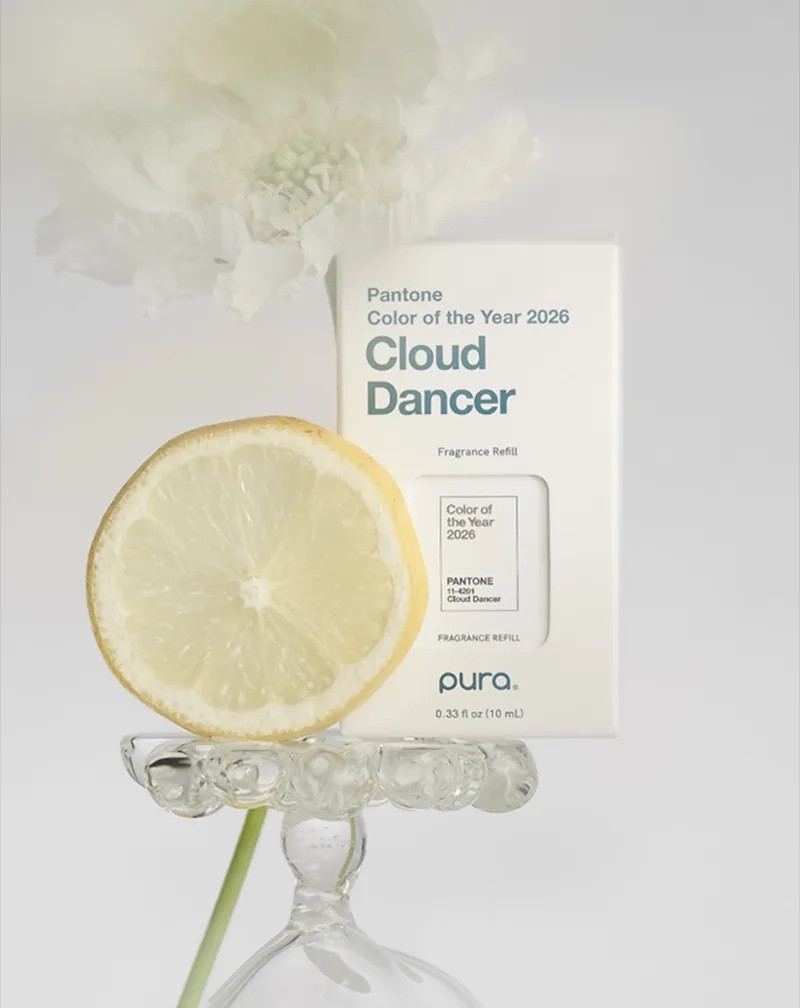
2. A Strategic Shift in Packaging Design: From Noise to Narrative
"Cloud Dance White" has a transformative impact on packaging. It shifts the design philosophy from chaotic visual expression to conscious simplicity. In a crowded market, packaging that offers visual soothing comfort can establish a strong, almost therapeutic connection with consumers.
A.Enhancing the Perceived Premium Quality
White has long been associated with luxury, purity, and quality. "Cloud Dance White," with its sophisticated warm tone, elevates this perception to a new level. It conveys a thoughtful elegance and a high-end modern feel. Packaging in this hue instantly conveys a brand's confidence—focusing on the intrinsic quality of the product rather than relying on superfluous embellishments. This makes it an excellent choice for packaging cosmetics, skincare, premium foods, and technology products, where trust and a premium positioning are paramount.
B.Advocating Sustainability Through Visuals
The aesthetic concept of "Cloud White" has a profound synergy with the sustainable packaging movement. Its natural, unartificial characteristics visually align with eco-friendly values. This color complements packaging made from recycled paper, molded fiber, or other unbleached natural materials, as it highlights the inherent texture of the materials. When brands use "Cloud White" on similar materials, they can tell a coherent story about purity, responsibility, and environmental harmony without needing to elaborate.
C.The Ultimate Canvas for Brand Colors
Perhaps its most powerful function is as a background or primary color. As a structural canvas, "Cloud White" allows a brand's signature colors or striking accent colors to truly stand out. This enhances visual contrast and layering on the shelf. Furthermore, it creates unparalleled space for storytelling through texture—embossing, debossing, and special techniques such as soft coatings or partial transparent inks become highly tactile and visually appealing against this gentle white background.
Expert Insight: “Cloud White is far from being a blank or industrial hue. It’s a white that needs to be perceived. Its warm, creamy tones…help shadows stay vibrant in a space,” comments textile and color designer Margaret Odgard. This highlights its unique ability to add depth and perception to physical packaging.
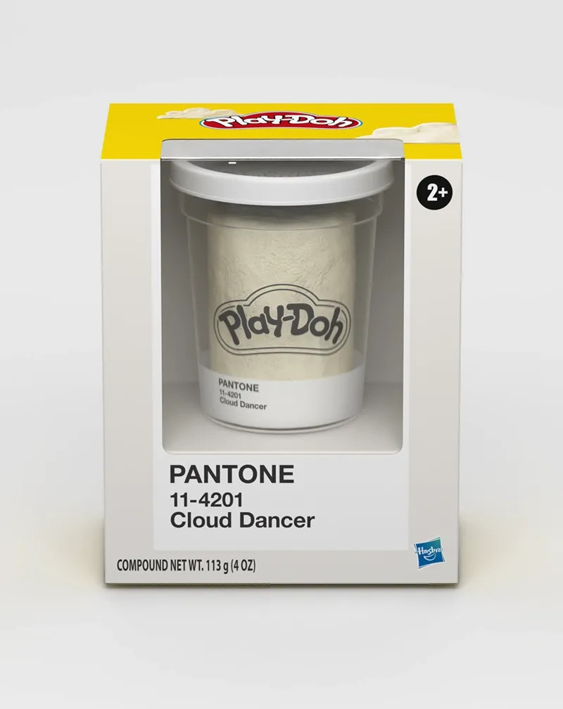
3. From Trends to Practical Solutions:
DHPBOXES' Solutions Understanding trends is one thing; executing them flawlessly in custom packaging is quite another. At DHPBOXES, we focus on translating these strategic color insights into tangible, high-impact packaging solutions that resonate with consumers and strengthen brand value.
Learn more about DHP BO's trending packaging boxes
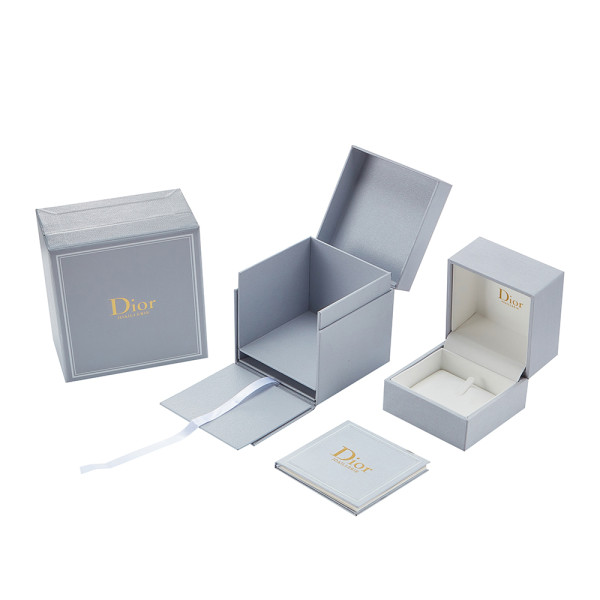
High quality personalized watch set box for brand, Premium gray board, velvet interior and closure.
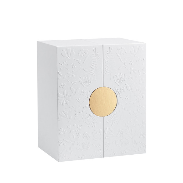
Perfume Gift Box Supplier | 120gsm Coated White Fancy Paper Mount Gray Board Material | White EVA Foam Insert Wrap Gold Paper
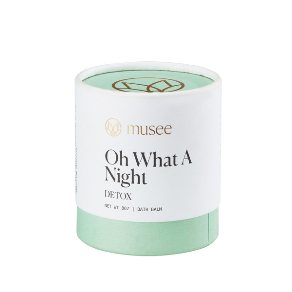
Custom Paper Cylinder Packaging Box| Eco-friendly Recycled Cardboard Tubes Material Packing Skin Care Body Bath Balm
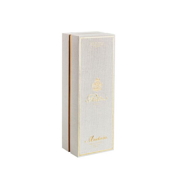
Luxurious Personalised Tequila Box Use for Whisky, Rum, Champagne, Vodka ect.
4. Conclusion: Embracing This Quiet Revolution
Pantone's choice of Cloud White as its 2026 Color of the Year is a call to brands to embrace purposeful simplicity. It invites brands to communicate with clarity, project premium quality, and align with consumers' growing desire for authenticity and sustainable practices.
This trend is not about what's missing, but about the presentation of wisdom. It makes a confident statement by providing a visual respite and a moment for the mind to focus on what truly matters—the value of your product and the story of your brand.
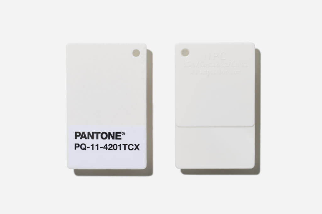
Ready to transform 2026 color trends into powerful, tangible brand equity?
The DHPBOXES team, with its deep expertise in color psychology, sustainable material sourcing, and precision manufacturing, can help you lead this quiet revolution in the industry. Contact us today for consultation on how to create bespoke packaging as thoughtful, sophisticated, and forward-thinking as "Cloud Dance White."
